I have always been interesting in the choice of a games art style and why they used specific colours in-game; therefore I have decided to explore the use of these things in some of my favourite games. Looking in depth about the colour choices and the psychology behind them; the way that colours and drawing style can
evoke different emotions within a game is truly astonishing and I wish to share my knowledge on this subject with you.

The colours in a game
are very important to the overall mood of the game; if you use dark colours it
is more likely to make the atmosphere more scary and eerie, if bright colours are used it makes it seem
more cheery and upbeat and if neutral pastel colours are used it makes a very
calm and peaceful surrounding. Colours can make a person feel so many
different emotions and this is obvious when used in a game environment. The main types of colour schemes used in games are; complementary colours which are opposite on the colour wheel, analogous colours which are colours next to each other on the wheel and monochromatic colours which are the different shades of one colour.
One of my favourite art styles is the
work of Telltale games; in their games The Walking Dead and The Wolf Among
Us they use a beautiful cel shaded 3D modelled scheme with perfectly
thought out colours and lighting. The use of cel shading in The Wolf Among Us
brings a gritty cartoon feel to the game; this means it can be serious and
childlike when needed. The style also gives it a unique look and brings depth
to the already created fictional world. The game also gives off a film noire
feel through its storyline, camera angles and art style this makes the player
feel more drawn to the game and more compelled to play it. The
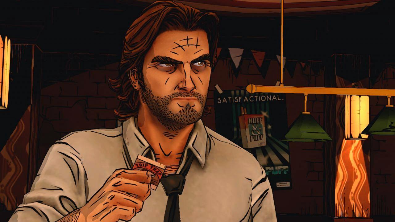
Wolf Among Us uses many different colours to create their dark moody environments for
example this image uses the complementary colours purple and yellow to create
a wary alleyway scene.

The purple in this image represents inferiority and the yellow anxiety, the characters in this image are unsure of the outcome of a potential fight in an alleyway but they know it isn't going to end well. Another good example is the uses of analogous colours in this next picture;

The pinks and reds used in this scene are connoting courage, weakness and 'fight or flight'; these colours have been cleverly used to show the power of the character but to also show that the other characters are going to retaliate but one of the sides isn't going to be as strong; this is due to the pink being a demasuculising colour and it being a sign of weakness, this paired with the red which is a powerful aggressive colour means that the two colours (characters) will clash.

The next game on my list has been called art rather than a
video game; Journey is honestly one of the best looking games of all time. The
cartoony look to the game gives it a light hearted feel however the game has
extremely well thought out colour schemes. The game uses no speech or text
therefore the environments, characters and music need to portray the mood and
storyline of the game; each different part of the game has different colour
schemes the darker the colours get the more dangerous and scary the section is
meant to be. Journey uses many colour schemes to create their beautiful environments;
one of the most powerful being a monochromatic scene.

In this image the use of orange tones create a calming and beautiful atmosphere, the colours are desaturated so they are not over powering. The use of orange gives a sense of comfort, security and warmth; the browns bringing tranquillity, earthiness and support to the environment. Journey also uses complementary colour schemes;

In this image the heavenly pastel pink and green create a soft and light feeling atmosphere; the added white connotes purity and beauty making the scene. The pink is used to create Physical tranquillity and the green harmony and peace; these colours will make the player feel calm and relaxed whilst exploring the beautiful landscape. Another good example is the use of analogous colours;

The purples create a reclusive scene with the blues making it feel cold; however the lighter blue sections are used to show intelligence and help guide you through the level. It is obvious to see why journey has been referred to as art rather than a game; the colours used with its beautiful art style produce a fantastic dynamic art experience.

The importance of art style and
colour choices is evident in

The analogous colours
used throughout the game create a cartoony but realistic world; the colours
being washed out and grey work perfectly with the whole gothic Tim Burton style of drawing. The browns and greens used make the scene very earthy and stable the yellow adds another layer of
The game Hotline Miami is also an amazing example of a
successful 2D game with an interesting art style. Hotline Miami's art
was influenced by the 80's and games of its time; the use of bright
neon colours and music work so well together and create an upbeat game
atmosphere which gets the player in the mood to smash some heads in (in-game of
course). Hotline Miami is a perfect example of how even low resolution 2D
games can still be as good as any 3D realistic game. Hotline
Miami doesn't really have a set colour scheme, they use bright wacky colours
that clash to create a trippy looking world; the use of the swaying scenes
helps create this atmosphere.

The bright neon
colours in-game denote the 80's due to the use of the same colours in this era.
The overall use of the pinks and reds connote emasculation and aggression
which help the player get in the mood; becoming an angry mask wearing killer. Clashing colours can mean lots of different things but it mainly shows confusion and anxiety, this fits the overall trippy feel to the game and the storyline.
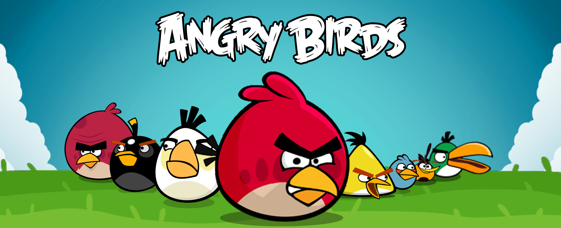
A great example of how art style can influence the
market is Angry Birds; they took a pre-existing game and threw some pretty
colours, cute characters and interactive sound effects on it and it has been
downloaded over 42 million times; just showing us how important art is to games
and how colour choices and draw a player in. Angry birds has mainly
used analogous colours to create a bright, happy and childish atmosphere.

The green is used to
show balance and also boredom, the bright colours used on the pigs makes your
eyes drawn to them making them the main target. The yellow used on the bird is
used to show confidence and power; this makes the bird seem more dominant than
the green pigs. The bright colours typically draw in players and the addictive game-play makes them stay, however if they game didn't have the appealing art style then the player wouldn't stick around for long; the overall alluring art style and colour make the game and without it I don't believe it would have sold more than 100 copies.

Don’t Starve and
Hotline Miami also show that 2D games are not dead, it is usually thought that 2D
games are inferior to 3D games but I believe that this is completely incorrect;
just because we don’t see them on next-gen does not mean that any realistic
looking 3D game is better. 2D’s classic characteristics will never be outdated
and no matter how elaborate 3D games become; 2D will always be at the heart of
the 3D and is evident in the games we know and love today.

After delving
into the world of art style and the psychology of colour it is clear to me how
important these aspects are to video games. In games such as Angry Birds it is apparent
that without the art style and colour schemes that game would have not sold
even half as much as it did. Journey would not be seen as a piece of art and
The Wolf Among Us wouldn’t be as unique and eye catching and hotline Miami would
just be another top down fighting game; without their art styles these games
would be boring and generic. Overall
we can see that 2D games and 3D games are equal; we look at games such a
journey and the power of the colours used are incredible the way that these
colours can create dense atmospheres and mood along with telling a story is
astonishing, it is now obvious to me how important these aspects are to
creating a brilliant video game. After looking at all of the colour
schemes in these games it is truly amazing how just a few colours, shades and
tones can make you feel different emotions and moods. By utilising colours
psychological meanings you can create incredible atmospheres like all of the games above. To make a good game you need to think about the style and colours you use.
References:
Justin
Towell. (2012). Why 2D will never die. Available:
http://www.gamesradar.com/why-2d-will-never-die/. Last accessed 25/04/2014.
Martin
Toney. (2013). The Wolf Among Us Wiki: Everything you need to know about the
game. Available: Justin Towell. (2012). Why
2D will never die. Available: http://www.gamesradar.com/why-2d-will-never-die/.
Last accessed 25/04/2014.. Last accessed 25/04/2014.
THE BOOK. Available: http://theartofjourney.com/. Last accessed 25/04/2014.
http://uk.ign.com/.
(2013). AN APPETIZING, LONELY FEAST.. Available:
http://uk.ign.com/articles/2013/05/02/dont-starve-review. Last accessed
25/04/2014.
Tom
Bramwell. (2012). Hotline Miami review. Available:
http://www.eurogamer.net/articles/2012-10-23-hotline-miami-review. Last
accessed 25/04/2014.
Teo.
(2010). Angry Birds Hits 42 Million Free and Paid downloads. Available:
http://www.symbian-freak.com/news/010/12/angry_birds_hits_42_million_free_and_paid_downloads.htm.
Last accessed 25/04/2014.
Angela
Wright. (2008-14). Psychological Properties Of Colours.Available:
http://www.colour-affects.co.uk/psychological-properties-of-colours. Last
accessed 25/04/2014.
No comments:
Post a Comment