26/04/2015

Off the Map: Back on track

So its back to working on Off the Map after an extended Easter due to presentations, essays and character project re-submissions. Anyway getting back on track after a long break and not a lot of progress Braden and myself have been working on engine stuff and after our presentation on Tuesday we have changed a few things; after getting good feedback from tutors.

Here is the main feedback we received from the tutors:
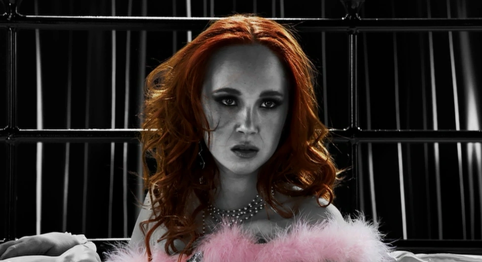
  • Alice character needs to go into game ASAP! High risk of not having tested her in game, especially as she is a different style.
  • Need to finish texturing
  • Have Alice on a ledge at the start of the game, paused, don’t start with her falling.
  • Piles of leaves don’t read well
  • Put all elements in such as paper cuts, particle effects, work on lighting in last section.
  • Love the interface, really helps pull everything together.

Stas: In the presentation it was evident that there was a broad range of interests in the design process. It is important to have the confidence to focus on the most unique and strongest of these keeping a coherent theme throughout. However the look and feel are very good. You need to work hard to keep the elements coherent and balanced. This does mean implementing the character ASAP and evaluating the overall feel and design.

As you can see there is some obvious things we were already going to do; such as get Alice in ASAP and texturing. However some things like having Alice starting on a ledge was not previously thought about; The leaf piles have also been redone now to look more realistic.

Here's the video we showed in the presentation; it has been changed slightly since then but I have some screen shots the show after:


After the presentation we decided to upgrade our level to 4.7.6 from 4.6.1 so that Luke's particle effects would import correctly so that he would not have to redo these. Here are the screenshot of the level in 4.7.6:


There is still a hell of a lot to finish but hopefully with everyone working on it now it should come together quickly. Here's a quick plan of what everyone will be doing up until the deadline:


I also recived an email from Game City about what exactly you need for the OTM hand in; here's what we need:

Documentation
5 – 10 page presentation document/powerpoint.
This should introduce your project to the judges and provide an overview of your project and process.
A longer document, either via blog or pdf format, covering your workflow throughout the course of the project.
Data
Please use the following folder structure:
Top Folder (TeamName_ProjectName)
/Documents
– Project Document PPT
– Project Document Detailed – Team Picture
– Project Logo
Game Executable (windows / OSX executable file/ installer)
Videos – 1 – 2 minutes long. First 3 – 5 seconds should contain the following information:
– Team Name & Project Name
– British Library logo
– GameCity logo
– Final 3 – 5 seconds should also contain the information above

We have a few of these things at the moment however there is still a lot to do and we still have not gotten the group blog done yet. Some of these things will just have to be done after the DMU handin.

Thats everything so far;
Cherrio for now.

19/04/2015

The 5 day count down

Another week has gone and we are 5 days closer to the resubmission and essay deadline; Luckily I have finished my character project!

It took a whole day of rigging (8am-5pm) and 3 rigs but my character is finally finished and looking fab. I also got some help and managed to get the alphas working on my character too (this was a problem with UE4 and I have ended up setting my material to translucent rather than masked). So without further adieu here he is:
 3DS Max renders

 UE4 renders

Overall I am really happy with my revised character but I am even more glad that it is over, so that I can move onto doing my unintentionally put off essay. I have been to the library and gathered more references and now its just the hard job of writing everything up.

My presentation didn't go quite as planned earlier this week but at least its out of the way now. I can now focus all of my attention on my essay and OTM. 

Cheerio for now.

13/04/2015

Texturing with awful alphas

So I've managed to get my texturing done on my character and he looks fab in 3DS Max;


I'm really pleased with how the texturing has come out, however I am having a few issues with how they look in UE4. The alphas just don't look the same as they do in 3DS max, I'm not sure if its just the engine or if its to do with my file compression but they just look damn awful. Tomorrow I and going to get some tech help and hopefully figure out why they look so bad. Here they are below;


I got some feedback from Steve and Craig earlier today, they said it was going well but I should move the pom poms further apart, give the balloons more loops and add blood to the outfit like before; I have now implemented all of these things and hopefully it is looking how they want it to now. For the texture sheets I have used a 1024 for the main body including a normal map. a 512 for the alphas and a RGB set of roughness maps and finally a 256 for props.


Now all I have to do is figure out whats wrong with the alphas and rig it. Oh and of course get everything ready for my presentation and start my essay that is due in 2 weeks; wish me luck.
Cheerio for now.

06/04/2015

Fluffy potato character

The modelling is done! Well for now at least; I might end up revising somethings after texturing and rigging. Anyway here is what my character is looking like at the moment;
Character with old texture
Un-textured model
I'm felling a lot better about how my character looks; the alphas make the silhouette more interesting and also makes the character look less like an action figure (made of plastic). I love the way that my alphas have come out and I am definitely going to use them again for fur or hair etc. (to make everything fluffy and adorable!).
The only problem with using alphas is the tri count, my revised model is now 4641 tris where as the original was 3983 tris; I don't think it's that big of a problem but it will be something I keep my eyes on when using alphas in the same way for another project.

Old model and new model.
When comparing my revised model to the old one, I can see why I got asked to work on it; with just a few simple changes and fixes the model looks a lot better. Next on my list of things to do is unwrap and texture the model and then finally rig the character. When it comes to texturing I have decided to split up the model into 3 maps; a 1024 for the main body, a 512 for alphas (including the frilled cuffs, fur, fluff and a new alpha for the ruff) and a 256 for props (the hat and balloons).

That's all for now hopefully I can keep on beating the potatoeyness, and keep it at bay!
Fight the potatoeyness!
I will update you soon which will probably be when I am back in Leicester,
Cheerio for now.


References:
It's so fluffy .gif: http://gifrific.com/its-so-fluffy/
Cat vs. potato .gif: http://www.reddit.com/r/gifs/comments/1qr8wq/cat_attacking_large_potato/

02/04/2015

Sin City presentation 2.0

As promised I am doing another presentation on Sin City as if I haven't done enough projects on it already; nevertheless I have finally decided to do my presentation on the second Sin City film; Sin City: A dame to kill for. So I have watched and taken notes on the film so far and I really like it; its not as good as the first but they had a lot of problems with timelines in this one, due to their being 3 separate stories in one and they all happen at different times. Despite the confusing timeline the film is really enjoyable and I am glad I have chosen to do my presentation on it; now I just have to watch it 20 more times. 

The films colours do seem to correlate however I feel that the new one uses colours more for visual appeal where as the first film used them for hidden meaning. There are some new colours used in the  film and I do have some theories of what they might mean.

Firstly Orange:
Orange is featured on Marv's pills, 'Kadie's Bar' sign and Sally's Hair.
  • Orange can be seen as a fiery colour so it could mean that it is fierce or dangerous.
  • "Orange offers emotional strength in difficult times. It helps us to bounce back from disappointments and despair, assisting in recovery from grief." (1)
  • Orange is a self-indulgent colour.
  • Orange represents Adventure and risk taking it also promotes physical confidence and enthusiasm. This links well to 'Kadie's Bar'.
Sally
Pink:
Pink is only used on Sally's lingerie.
  • Pink is often referred to as being sexy.
  • It is also a very bold and powerful colour, suggesting that she is a strong woman.
  • It can also be seen as a calm colour which could show weakness.
  • Pink "reassures our emotional energies, alleviating feelings of anger, aggression, resentment, abandonment and neglect." (2) This fits in well to the story of the character the pink could be showing that she has calmed down after a near death experience.
Blue:
Blue is used in the first film when information is being passed, in the new film Ava wears a bright blue coat.
  • In the first film blue is also shown if someone is a traitor; this applies to Ava's character.
  • "This color is one of trust, honesty and loyalty. It is sincere, reserved and quiet, and doesn't like to make a fuss or draw attention. It hates confrontation, and likes to do things in its own way." (3) Blue in our case could be used contradictory so that people feel as if they can trust Ava even though they cannot.
  • Can be seen as being deceitful and spiteful.
  • "It can also indicate manipulation, unfaithfulness and being untrustworthy." (4)
Ava
Finally natural colours:
By this I mean unprocessed colours; shown in all of the fire and explosions and in particular Marcy.
  • Marcy is shown as the only person which natural skin tones; this could be to show that she is pure. This can also relate to the fire showing that it is also pure.
  • It could show that she is full of life and that the darkness of Sin City has not yet gotten to her.
Marcy and Johnny
There is so much more I could research into but I think I am going to start writing my presentation soon or I will end up in a massive Sin City spiral and want to do a 20 minute presentation rather than a 3 minute one.
Cheerio for now.


References:
(1) Judy Scott-Kemmis. The Color Orange. Available: http://www.empower-yourself-with-color-psychology.com/color-orange.html. Last accessed 30/02/15.
(2)  Judy Scott-Kemmis. The Color Pink. Available: http://www.empower-yourself-with-color-psychology.com/color-pink.html. Last accessed 30/02/15.
(3) Judy Scott-Kemmis. The Color Blue. Available: http://www.empower-yourself-with-color-psychology.com/color-blue.html. Last accessed 30/02/15.
(4) Judy Scott-Kemmis. The Color Blue. Available: http://www.empower-yourself-with-color-psychology.com/color-blue.html. Last accessed 30/02/15.